{
"$type": "site.standard.document",
"content": {
"$type": "site.standard.content.markdown",
"text": "If you only came here for the revelation I had the other day, it's this: use HSL.\n\nWe're so used to specifying colours as RGB values. And yes, hex codes are just another way of writing RGB (00 is 0, FF is 255, so #FF0000 is red - 255, 0, 0).\n\nIt's hard work to keep track of what colours work well together, and most of us can't easily imagine what a colour like #D00D1E might look like instantly.\n\nSure, you can get there eventually if you break it down in your head: D0 is quite a lot of red, 0D is not much green at all, and 1E is a smidge of blue, so this is probably quite a bright red. And it is: <span class=\"w-[1em] aspect-square inline-block rounded align-middle\" style=\"background-color: #D00D1E\" />\n\nBut it's INCREDIBLY easy to make good looking colour palettes with HSL. How does it work?\n\nInstead of specifying RGB values, you pick a hue, a saturation, and a lightness (ie: an 'H', an 'S', and an 'L'). Hues are spread around a circle which mimics the old 'ROYGBIV' acronym we already know from school, running round a clock. 12 (or 0°) is red. 1 o'clock (or 30°) is orange. 2 o'clock (or 60°) is yellow. 3 o'clock (90°) is a chartreuse, 120° (or 4 o'clock) is green, 150° is an emerald green (5 o'clock), and 180° (6) is cyan. 7 is azure and 8 is ultramarine, and by 9 o'clock (or 270°) we're at violet, with magenta at 10, and a crimson colour at 11.\n\nThis clock shows the hue wheel beautifully and starts to hint at some basic colour theory concepts—colours opposite each other on the wheel will often go together very nicely.\n\n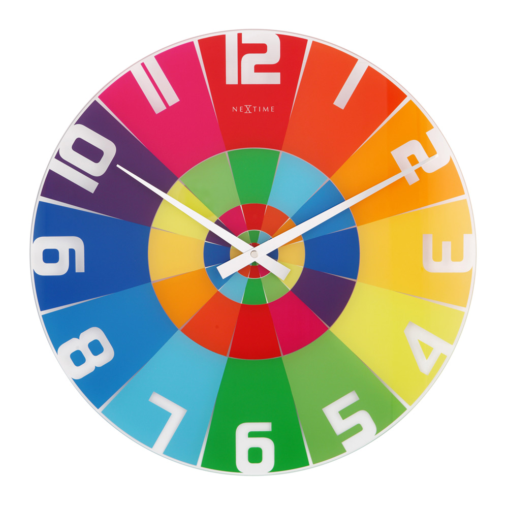\n\nThere are a lot of colour harmony theories out there, but one thing that is sure is that different shades of the same colour go well together.\n\nFor example, [Traist](https://traist.co.uk)'s primary brand colour is #0C6291, which translates to 201°, 85%, 31% in HSL. Without even thinking, I know immediately that any other colour with the hue of 201 will work.\n\n> This post includes an interactive component. [View it on joeinn.es](https://joeinn.es/blog/better-colours-easily)\n\nIf I want a grey, I can turn the saturation down closer to 0. If I want a bright colour, I can zap the saturation right up. If I want the colour to be light, I can pick a high 'lightness' value. And it won't ever clash. Sure, unless you set out your palette in advance, you can end up with 10 000 different shades of blue on your website, but it won't look disgusting.\n\nYou can also derive your secondary colour by subtracting your hue value from 360. For example:\n\n> This post includes an interactive component. [View it on joeinn.es](https://joeinn.es/blog/better-colours-easily)\n\nNow you've got two completely usable colours.\n\nWe can play a little bit with music theory too. So we know that a perfect fifth is 3:2, so we can 'see' a perfect fifth by multiplying our hue by three, then dividing by two:\n\n> This post includes an interactive component. [View it on joeinn.es](https://joeinn.es/blog/better-colours-easily)\n\nSo now we've got a root, a complement, and a 'perfect fifth', we can also do, for example, a minor third, which is 6/5.\n\n> This post includes an interactive component. [View it on joeinn.es](https://joeinn.es/blog/better-colours-easily)\n\nOr we can use the golden ratio of 1.618:\n\n> This post includes an interactive component. [View it on joeinn.es](https://joeinn.es/blog/better-colours-easily)\n\nBy only changing one value at a time, you can create even very different hues which look visually consistent. Another trick you can use if you need to generate something that looks consistent and is repeatable but different with different inputs is one I used the other day in my post about [Avenir](https://joeinn.es/blog/avenir).\n\nEach font sample is generated dynamically, just by using the `.charCodeAt()` string method, and a `reduce()` function to calculate a number. Then, I use the `%` operator to make sure that my value falls in the range of 0-360. Now I've got a (semi) unique hue for my font, I can play with saturations and lightnesses to produce a card that looks good regardless of the font.\n\n<div class=\"full-bleed not-prose\">\n > This post includes an interactive component. [View it on joeinn.es](https://joeinn.es/blog/better-colours-easily)\n</div>\n\nOr at least, the colours look good...\n\n<div class=\"full-bleed not-prose\">\n > This post includes an interactive component. [View it on joeinn.es](https://joeinn.es/blog/better-colours-easily)\n</div>\n\nNot much I can do about your choice of font though...",
"version": "1.0"
},
"description": "Using RGB values to define colours is difficult to wrap your head around, and requires a lot of mental effort to know how to develop a colour palette that will make your site look good. There's a better way.",
"path": "/blog/better-colours-easily",
"publishedAt": "2022-10-04T21:06:51.115Z",
"site": "https://joeinn.es",
"textContent": "If you only came here for the revelation I had the other day, it's this: use HSL.\n\nWe're so used to specifying colours as RGB values. And yes, hex codes are just another way of writing RGB (00 is 0, FF is 255, so #FF0000 is red - 255, 0, 0).\n\nIt's hard work to keep track of what colours work well together, and most of us can't easily imagine what a colour like #D00D1E might look like instantly.\n\nSure, you can get there eventually if you break it down in your head: D0 is quite a lot of red, 0D is not much green at all, and 1E is a smidge of blue, so this is probably quite a bright red. And it is: \n\nBut it's INCREDIBLY easy to make good looking colour palettes with HSL. How does it work?\n\nInstead of specifying RGB values, you pick a hue, a saturation, and a lightness (ie: an 'H', an 'S', and an 'L'). Hues are spread around a circle which mimics the old 'ROYGBIV' acronym we already know from school, running round a clock. 12 (or 0°) is red. 1 o'clock (or 30°) is orange. 2 o'clock (or 60°) is yellow. 3 o'clock (90°) is a chartreuse, 120° (or 4 o'clock) is green, 150° is an emerald green (5 o'clock), and 180° (6) is cyan. 7 is azure and 8 is ultramarine, and by 9 o'clock (or 270°) we're at violet, with magenta at 10, and a crimson colour at 11.\n\nThis clock shows the hue wheel beautifully and starts to hint at some basic colour theory concepts—colours opposite each other on the wheel will often go together very nicely.\n\nThere are a lot of colour harmony theories out there, but one thing that is sure is that different shades of the same colour go well together.\n\nFor example, Traist's primary brand colour is #0C6291, which translates to 201°, 85%, 31% in HSL. Without even thinking, I know immediately that any other colour with the hue of 201 will work.\n\nThis post includes an interactive component. View it on joeinn.es\n\nIf I want a grey, I can turn the saturation down closer to 0. If I want a bright colour, I can zap the saturation right up. If I want the colour to be light, I can pick a high 'lightness' value. And it won't ever clash. Sure, unless you set out your palette in advance, you can end up with 10 000 different shades of blue on your website, but it won't look disgusting.\n\nYou can also derive your secondary colour by subtracting your hue value from 360. For example:\n\nThis post includes an interactive component. View it on joeinn.es\n\nNow you've got two completely usable colours.\n\nWe can play a little bit with music theory too. So we know that a perfect fifth is 3:2, so we can 'see' a perfect fifth by multiplying our hue by three, then dividing by two:\n\nThis post includes an interactive component. View it on joeinn.es\n\nSo now we've got a root, a complement, and a 'perfect fifth', we can also do, for example, a minor third, which is 6/5.\n\nThis post includes an interactive component. View it on joeinn.es\n\nOr we can use the golden ratio of 1.618:\n\nThis post includes an interactive component. View it on joeinn.es\n\nBy only changing one value at a time, you can create even very different hues which look visually consistent. Another trick you can use if you need to generate something that looks consistent and is repeatable but different with different inputs is one I used the other day in my post about Avenir.\n\nEach font sample is generated dynamically, just by using the string method, and a function to calculate a number. Then, I use the operator to make sure that my value falls in the range of 0-360. Now I've got a (semi) unique hue for my font, I can play with saturations and lightnesses to produce a card that looks good regardless of the font.\n\n > This post includes an interactive component. View it on joeinn.es\n\nOr at least, the colours look good...\n\n > This post includes an interactive component. View it on joeinn.es\n\nNot much I can do about your choice of font though...",
"title": "Better Colours Easily"
}